I’m sure you are already familiar with the desktop environments of both operating systems so I’m just going to outline here the most interesting aspects of each one. Some details will be left for further posts as they are interesting enough on their own. Here we go:
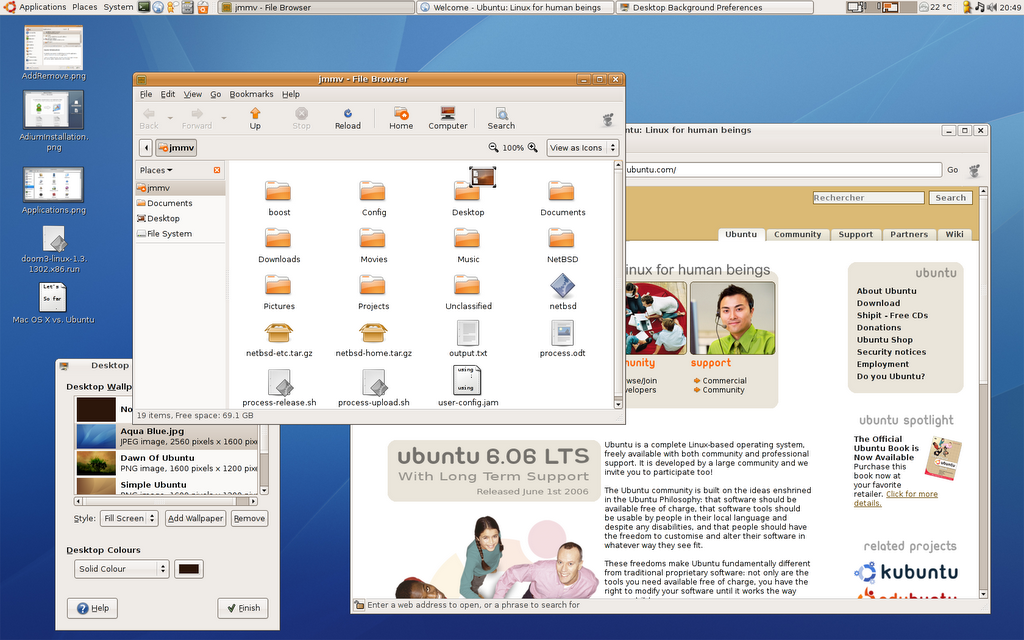
Ubuntu, being yet another GNU/Linux distribution, uses one of the desktop environments available for this operating system, namely GNOME. GNOME aims to be an environment that is easy to use and doesn’t get in your way; they are achieving it. There are several details that remind us of Windows more than Mac OS X: for example, we have got a task bar on the bottom panel (that is, pardon me, a real mess due to its annoying behavior) and a menu bar that is tied to the window it belongs to.
It is interesting to note that the panel is highly configurable and lets you reorganize its items, add new ones and even create new panels to keep things grouped. The same goes for the desktop look, which can be configured to your liking through themes that affect the window borders, widgets and icons.
A feature I miss is the ability to configure screen hot corners to trigger some actions, but I guess that some third party application could allow me to do that. Oh, also note that the desktop does not have any fancy 3D effects by default such as drop shadows, transparencies nor anything like that. People are working in these features lately (Xgl), but they are not yet ready for the end user.
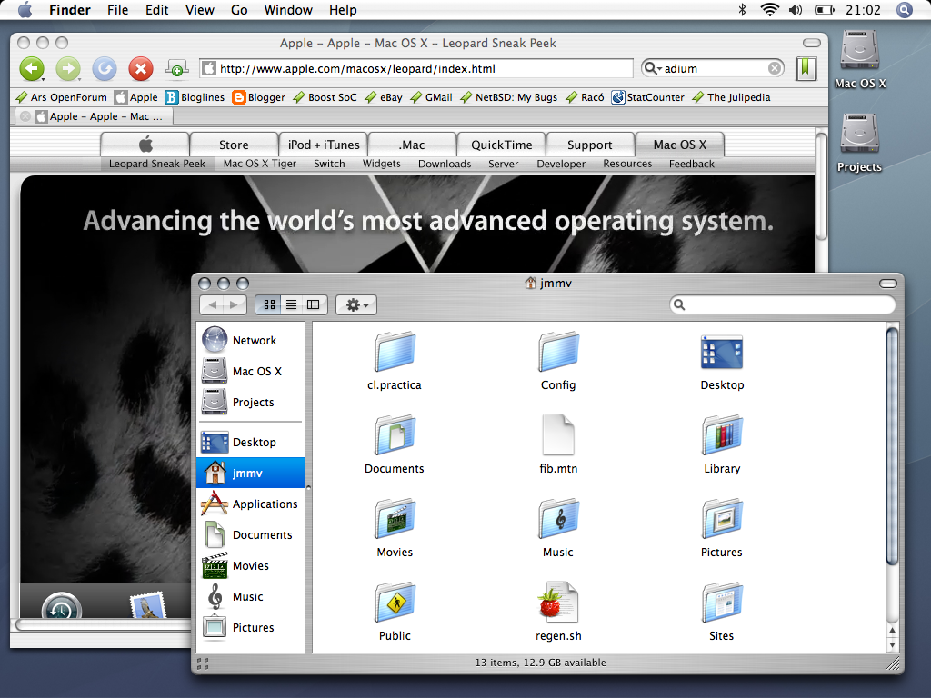
Mac OS X, on the other hand, is quite unique in its interface. Applications have a single menu bar that sits on top of the screen; this makes it very easy to reach and also groups all windows that belong to a single application (you know how annoying The GIMP is in this aspect, don’t you?). On the other hand, the Dock replaces the typical task bar and also implements the ability to launch applications. Some may not like this but I love the merging of the two concepts: it doesn’t matter if a program is currently running or not; you simply click its Dock icon (or even drag a file over it!) and it pops up to the front.
This desktop is also famous for its graphical effects. As a curiosity, the active window has a drop shadow that makes it outstand from all others (quite handy). But more importantly, it makes it possible to implement things such as Exposé, which is a great task switcher. This makes me think of the hot corners I mentioned above: it is very useful to be able to configure actions for each corner so that they are triggered when you move your mouse over them.
At last, and as far as I know, the Mac OS X interface is not theme-able by default. You can change some of its colors (from Aqua to Granite), but that’s it. Oh, but I forgot to say that there are at least three different themes applications can use, and the one they show depends on them alone. This means that there are some inconsistencies all around as some applications use the brushed metal theme while others don’t. Not a big problem for me, and there are rumors that this will be resolved in Leopard.
Well… I guess this is not very enlightening, but the two interfaces have been compared countless of times. I even wrote some articles in the past about it: see this or that. So that’s all for now. (And if I you want me to choose one, I go for the Mac OS X interface.)


Featured software
Featured posts
- Fast machines, slow machines
- EndBASIC 0.10: Core language, evolved
- Farewell, Microsoft; hello, Snowflake!
- Rust is hard, yes, but does it matter?
- Rust traits and dependency injection
- A year on Windows: Introduction
- Always be quitting
- How does Google keep build times low?
- How does Google avoid clean builds?
- Unit-testing a console app (a text editor)
- More...
