Windows is about managing windows so it should excel at window switching. Uh huh? Let’s investigate how that works in this episode and how Windows’ approach feels to a long-time macOS user. Spoiler alert: I never really liked macOS’s way.
A blog on operating systems, programming languages, testing, build systems, my own software projects and even personal productivity. Specifics include FreeBSD, Linux, Rust, Bazel and EndBASIC.
Alt+Tab window cycling
On macOS, there are two main shortcuts to navigate between open windows: Cmd-Tab switches between apps and Cmd-` switches between windows of the same app.
On Windows, there is only Alt-Tab to switch between any open window no matter what app it belongs to.
macOS’s behavior is quite confusing at first and, even after getting used to it, not really a great idea—at least in my opinion. Why should Cmd-Tab bring all browser or terminal windows to the front at once? This usually makes no sense. I put up with macOS’ behavior for years and even tried to justify it, but honestly, I prefer Windows’ approach here.
Why the difference? I don’t know for sure but I hypothesize that this is related to limitations of the first Mac OS versions and Multiple-Document Interfaces (MDIs) being a popular UI design element 20–30 years ago.
An MDI app is a program made up of one large container window, which represents the app, and multiple smaller windows hosted within it. Each of these windows typically represents one document—hence the Document in MDI—but they can also represent a toolbox or other supporting functionality. The host window is responsible for offering features to manipulate the inner windows.
To illustrate how this looks like, it is easiest to go back to the Windows 3.x days when MDI apps were very popular. Take, for example, the standard Windows 3.11 desktop where the Program Manager and the File Manager were both MDI apps:
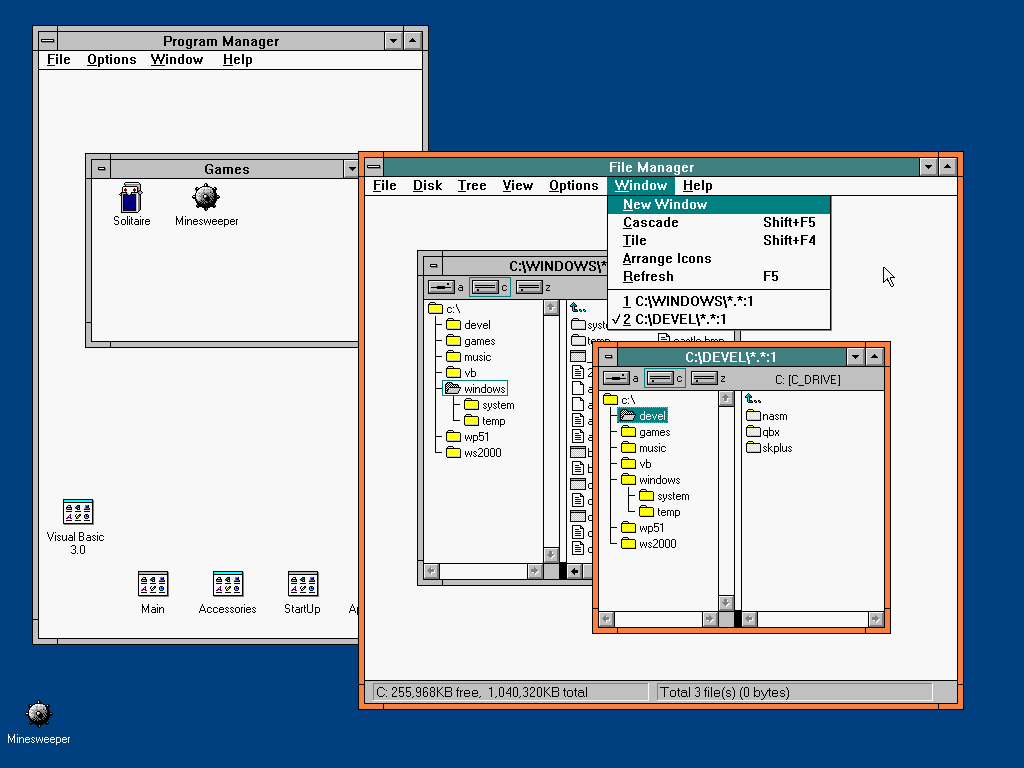
In the figure above, note how both the Program Manager and the File Manager are large container windows for smaller windows within them. Both of these apps have a Window menu with operations that would typically be associated with a window manager. In a sense, each of these apps is its own window manager.
Contrast this to a multi-window non-MDI app. For illustration purposes, let’s also look at a contemporary app of the Windows 3.x times, Visual Basic 3.0:
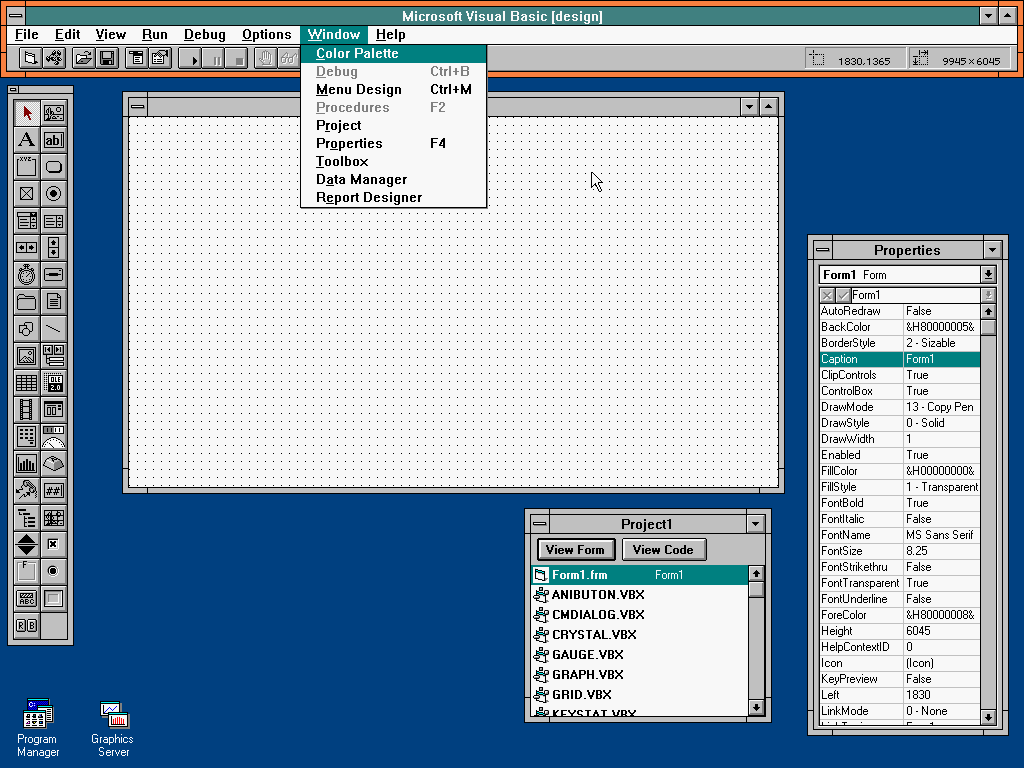
In this other figure, note how Visual Basic 3.0 is made up of many standalone windows even when it ran on the same platform I showed earlier. Different paradigms, same OS.
My theory is that, because MDI was a very popular design paradigm when the Windows platform was growing, there never was a need to separate app switching from window switching. Alt+Tab let you cycle through open apps—and that was all you needed: once you were inside the desired app, you would have to know how to navigate its own windows.
However, Mac OS (the original) never had this concept of MDI apps. Instead, apps were made of individual windows and it wasn’t until Mac OS X that you could interleave windows from different apps. In such a scenario, you wouldn’t want Cmd+Tab to cycle between “primary” windows such as documents and auxiliary windows such as toolboxes. There was a need to separate the two, and this is why Cmd+Tab and Cmd+` are different on macOS to this day.
But that’s just a theory. It makes sense in my head but I’m not sure if that’s what happened.
Nowadays, most apps have gained support for tabs or docked panels. It seems we have gone back to the features of MDI interfaces—both on Windows and macOS—but in a more structured and less flexible (for the better) manner. Given that this is becoming the norm in most apps on either platform, Cmd+Tab on macOS almost does the right thing today.
As a quick side note, another detail that used to bother me on macOS is how Cmd-Tab switches between all open apps regardless of what virtual desktop they are in. This causes you to flip-flop between desktops—and incur the cost of an useless scroll animation—if you mistakenly select an app that is on a separate desktop. I have never liked this behavior in macOS because it feels as if virtual desktops can’t be used to truly isolate different workflows. Windows has done the right thing and Alt-Tab is restricted to the apps open within the same virtual desktop.
Browser tabs
Now that we have established that Windows’ Alt+Tab behavior is sane on multiple fronts, I have to say that it is broken on one.
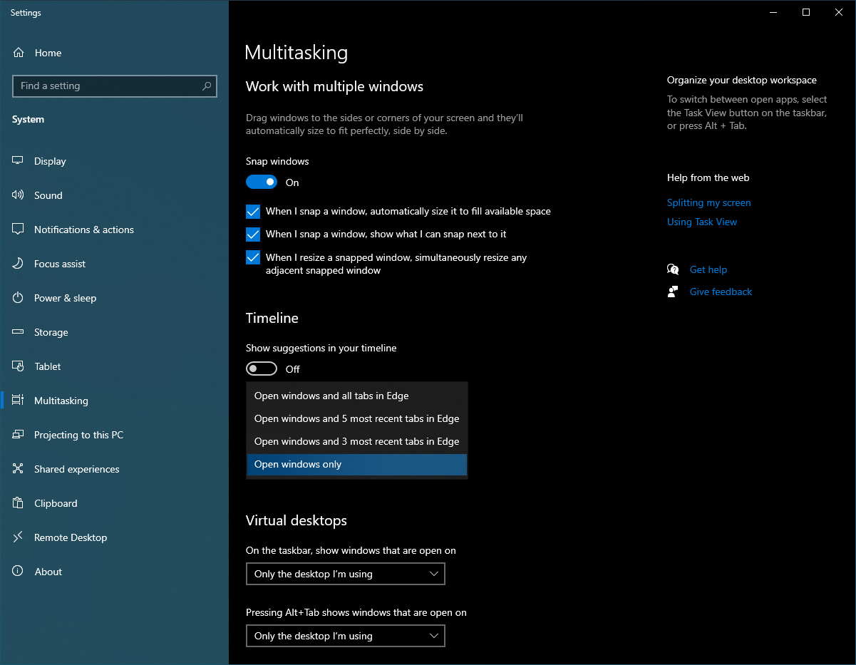
Someone recently had the brilliant idea of trying to make browser tabs behave as if they were independent apps and include them in Alt-Tab switching. I knew going in that I would despise this feature, but I gave it a try anyway. And no thanks. The browser is the browser, and I need it to remain a unit.
The good thing is that this behavior can be disabled as shown below. The scary thing is that telemetry may show that this feature is not used much and be scraped in a future release. (Oh, I’m repeating myself here.)
Task view
And finally, let’s briefly touch upon the Task view feature.
A great feature of macOS from the days of Mac OS X Panther (2003) is Exposé, now part of Mission Control. With a simple mouse gesture or shortcut press, all open windows shrink and become visible at once, allowing you to trivially pick the one you want to switch to.
“Oh, but Windows has this too!” you say. Indeed, Windows has had multiple iterations of this shiny feature, starting with the crappy Flip 3D in Windows Vista. It is not the same. You see: the killer differentiator of Exposé is that the shrunken windows maintain their relative position and size, and a little animation when entering Exposé lets you visually track where each window “came from”. This is what makes it possible to switch windows extremely easily with a touchpad swipe followed by a selection, because your mind can predict where each window will land.
The current iteration in Windows 11 is much better than all prior versions. In particular, the history view of past activity that exists in Windows 10 is thankfully gone and the shrunken windows can now occupy the whole screen. Just as a quick example, here is a snapshot of a Windows 11 desktop with four different overlapping apps:
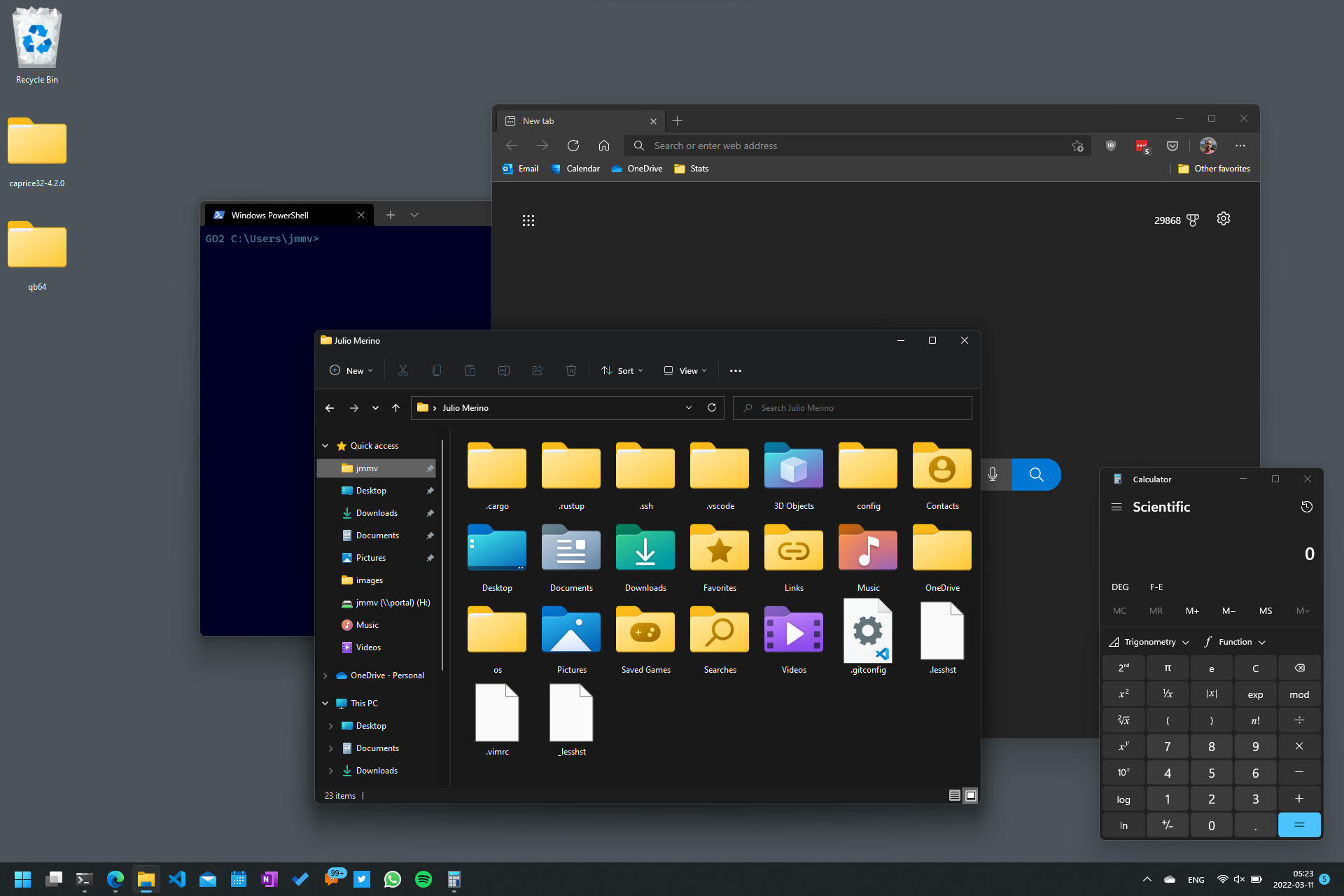
And here are those same apps in Task view mode:
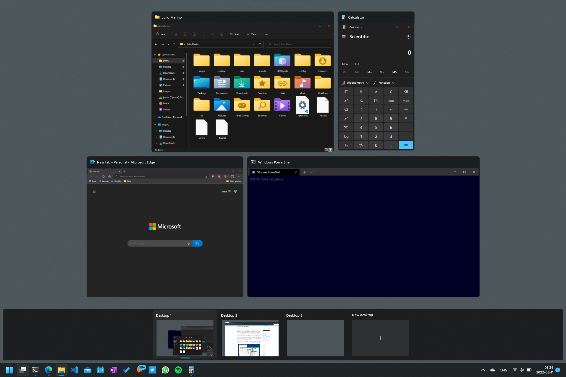
Note how the order of the apps in the Task view screen tells you nothing about where they used to be. You cannot predict what that view will look like before entering it. In fact, the order is either influenced by the currently focused window or it is random; I cannot quite tell.
I miss macOS’s Mission Control here, even though these days I primarily use the keyboard for task switching anyway.
Thanks for making it this far! Tomorrow (or maybe Monday because preparing these daily is taxing), let’s continue the UI review by looking into PowerToys, a long-forgotten brand that was revived less than two years ago.

