Enough complaining about keyboards, shortcuts, and input methods. Let’s shift this one-year reflection to the user interface and slowly towards more positive topics.
First of all, let’s make one thing clear: GUIs are like colors. There are plenty to choose from, everyone has their preferences, and that’s just fine. Windows’ GUI is what it is and doesn’t leave a lot of room for customization. If you are a macOS user, you have learnt to put up with a similar approach, but if you are a Linux user, you will despair at the lack of options.
A blog on operating systems, programming languages, testing, build systems, my own software projects and even personal productivity. Specifics include FreeBSD, Linux, Rust, Bazel and EndBASIC.
![]()
![]()
![]()
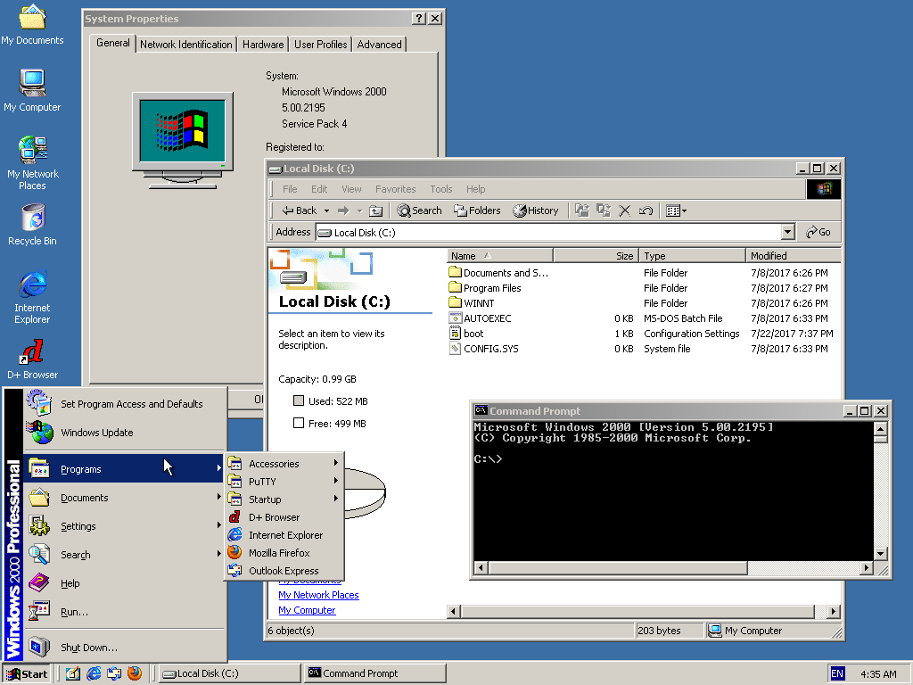
Personally, I think the Windows 2000 UI and the apps of the era were some of the best. A consistent UI throughout, with buttons you could see and menus you could inspect.
Anyhow. We are talking about last year in this review, which is the 2021-2022 period and not the year 2000, and that means Windows 10 and 11. And, honestly, I like these UIs too. I find the flat design of Windows 10 elegant, and Windows 11 has brought a bunch of nice touches. The fonts used throughout, like Segoe UI and Cascadia Code, are beautiful.
But let’s touch on specific design elements of the desktop.
Menubars
As a previous macOS user, switching from the “menubar at the top of the screen” to a “menubar-like thingy inside every window” is quite a change, especially after having been convinced that macOS’ approach is the only and possible way.
macOS’ rationale is that having menu entries at the top of the screen makes it much easier to select them with the mouse. That’s true in theory. But in practice? Do you use menus much? I rarely open menus and with most apps these days not having a menubar at all or coming up with their own ideas of what a menu is across all OSes (thank you, Electron?), it’s not the big benefit that it used to be.
Furthermore, on very large displays and screen resolutions, or on multi-display setups, macOS’ menubar-at-the-top starts to make less sense. So this change in UI design hasn’t been a big deal for me.
There is one thing I miss though: a very clear location on the screen that shows which app is currently active, by name. Because… it’s quite hard to tell which window is active otherwise.
The taskbar
As for Windows 11, say what you want, but the “taskbar in the center” is silly and obviously a cheap imitation of macOS.
The bottom-left hot corner of the screen is now non-functional, which is a loss in usability. Plus… it just looks ugly: the center-aligned program icons look out of place because the status icons are all still on the right side.
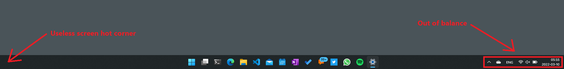
The good thing is that it’s still possible to select “icons on the left” by going into the taskbar settings. The scary thing is that telemetry—a hot topic I’ll cover last—may show “feature not used enough” and be scraped from future releases. Hopefully that won’t be the case.
Ribbons
The ribbon, which is a replacement for menus, is a design element that looks nice as well. I remember when it was introduced back in 2007 how it was touted as a major innovation in UI design, following many years of no revolutionary changes.
But… the ribbon has gotten in my way more than once. With old-style menus, all you had to do was run through a list of text entries to find whatever you were looking for. With the ribbon, you have to visually scan a mixture of buttons with text and bare icons, after making sure that the section of the ribbon you need is the one that’s selected.
I’ve been using the Office apps for a while now and still cannot get used to this. And if you dare click on the File menu, you get a completely different page that covers the whole app instead of a ribbon tab. Quite strange.
By looking at the changes in Windows 11 and newer versions of Office, it seems as if the ribbon is being phased out or is being replaced with something more predictable and that takes less screen space. But I have no idea if that’s what’s happening.
So… do I like it?
Yes. Overall, and despite these little complaints, the interface looks neat to me.
Before parting, I have to leave you with two thoughts. First, if you liked the Windows 95–2000 design era, take a look at the SerenityOS and ReactOS projects. And second, if you launch KDE Plasma 5… you won’t be able to tell if it is really KDE or Windows 11—at least from the perspective of the taskbar. (KDE was first.)
More tomorrow on window switching!


Featured software
Featured posts
- Fast machines, slow machines
- EndBASIC 0.10: Core language, evolved
- Farewell, Microsoft; hello, Snowflake!
- Rust is hard, yes, but does it matter?
- Rust traits and dependency injection
- A year on Windows: Introduction
- Always be quitting
- How does Google keep build times low?
- How does Google avoid clean builds?
- Unit-testing a console app (a text editor)
- More...
