
If you have followed our recent infrastructure posts, you know by now that we are actively migrating Snowflake’s build to Bazel. What we haven’t shared yet is that we have deployed our own Build Barn cluster to support Bazel’s remote execution features. We have chosen to run our own build farm service for resource governance and security purposes, but also because the behavior of this system impacts the developer experience so directly that we want to have full in-house control and knowledge of it.
Things haven’t been smooth-sailing though. While the initial deployment was simple, resource provisioning, performance tuning, and stability have been a struggle. Folks in the Build Barn community advised us to over-provision the cache and the worker pool—and we did—but such advice didn’t sound quite right: we had already invested as many resources in the build farm as we were using for our legacy builds, yet the Bazel builds couldn’t keep up with the load.
All combined, this was not a great story: users saw builds failing and we didn’t have a good grasp about what was going on. Until… we could see into the build farm behavior. As soon as we had pictures, the source of these problems became obvious. Let’s take a peek at what problems we had, how visualizations helped us diagnose them, and what solutions we applied.
Initial setup
When we deployed Build Barn at the beginning of the year in an in-house Kubernetes cluster, we didn’t put much thought into resource provisioning because our needs were modest. As we made progress through the migration, and as soon as we had the main product and its tests building with Bazel, we had to set up required Bazel build validation within our Continuous Integration (CI) system to minimize the chances of build regressions. This increased the load on the build farm as well as its reliability expectations.
Unfortunately, these led us to infrastructure problems. When those happened, all indicators pointed at issues in the build farm’s shared cache nodes. We didn’t have many metrics in place yet, but the few we had told us that the cache wasn’t keeping up in size or in performance, and we saw significant action queuing. Our reaction was to address the seemingly-obvious cause: the shared cache nodes were backed by slow EBS devices, so we moved them to locally-attached NVMe flash drives. Surprisingly though, this made little difference in overall performance.
Why? Why was it that the build farm could not keep up under load?
Profiling
My own hypothesis was that our cache nodes were starved of network. This was based on the observation that we have relatively few of them serving hundreds of workers and clients, and that the pathological workloads that brought us to the outages involved very large artifacts staged on many workers. We had no good data to prove this because we hadn’t yet added enough instrumentation to find a smoking gun, and the few metrics we had didn’t implicate the network.
Resolving this issue was in our critical path to complete the Bazel migration so I was determined to get a better understanding of it. Two previous bits of knowledge helped reach a solution: past experience with Paraver, a cluster-level trace visualization tool to observe execution behavior across machines, and the trace profile that Bazel emits, which looks strikingly similar but is opened via Chrome.
I spent a couple of hours prototyping a Python script that queries the database into which we dump build farm events, fetches action scheduling details during a time period, and turns those into a Chrome trace. The idea here was to show, for each worker node in the cluster, what each of its execution threads was doing. That is, I was interested in seeing whether each thread was:
- idle,
- downloading input artifacts from the shared cache,
- executing an action,
- or uploading output artifacts to the shared cache.
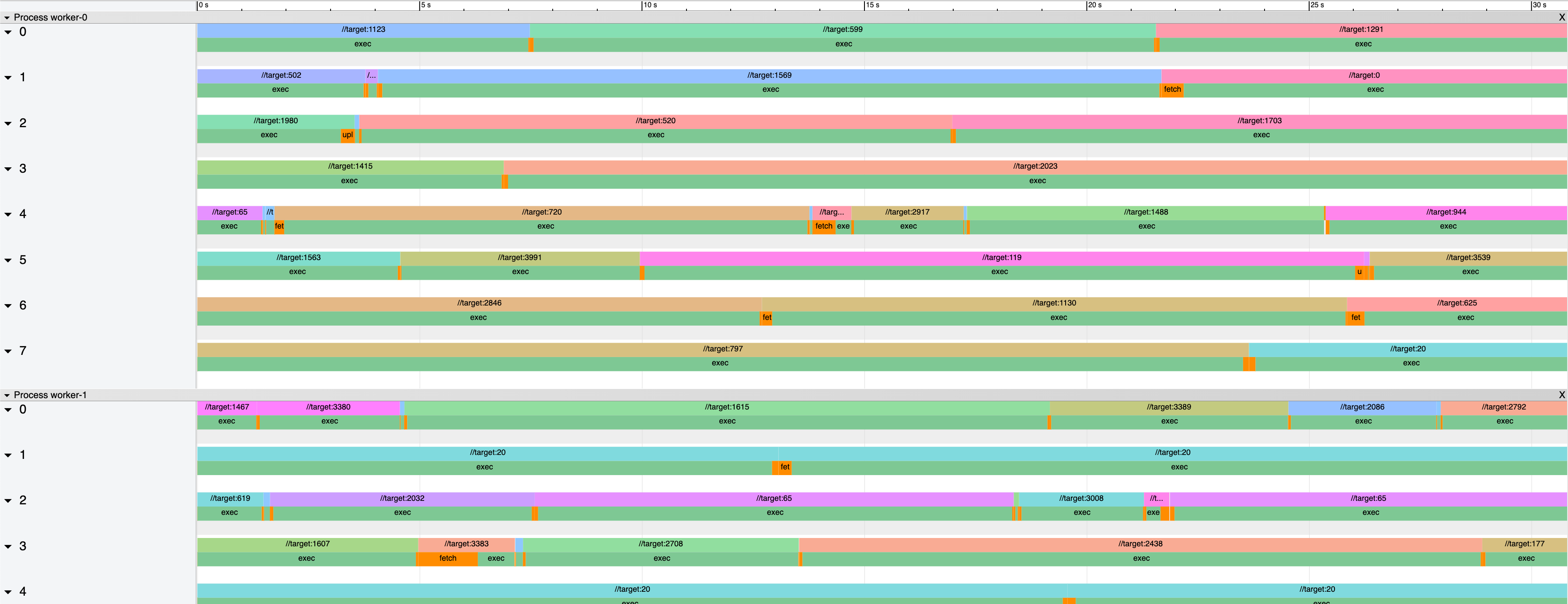
Here is one of the first pictures I obtained for a time period where we observed significant action queuing and thus build farm performance degradation:
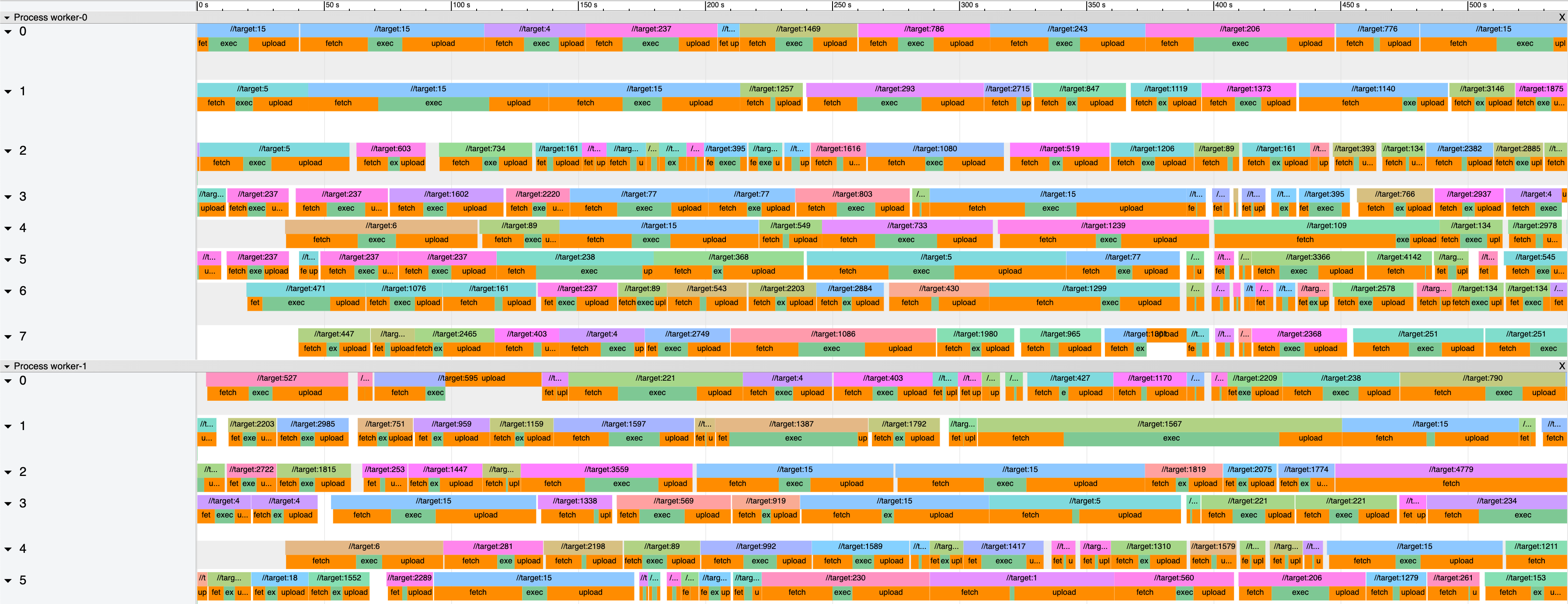
You can click to zoom into the picture, but the key thing to notice is this: orange corresponds to download/upload whereas green corresponds to execution. And the majority of the picture is orange.
This was the first indication that we truly had networking problems as I originally set out to prove. But while this visualization is really powerful to pinpoint the issue, it’s hard to quantify it. So I performed other computations and found that, for this period of time, workers were 97% utilized yet… they were only executing actions 20% of the time. A whopping 77% of the time was being lost to the network.
Or, shown another way: if we graph the different phases per second, we get this graph:
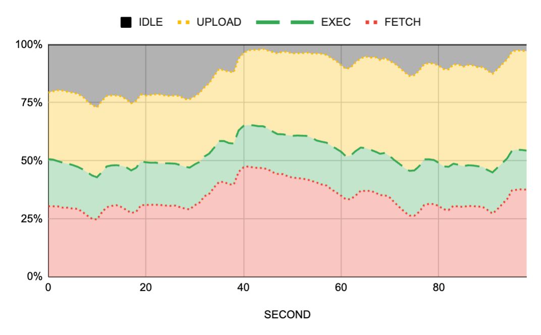
Much easier to see the problem and much easier to see that the networking overheads are constant over time.
Was it the network though?
So far, everything pointed at the network being the problem. But then, I looked at different time periods when the cluster wasn’t experiencing queuing and I also looked at the staging cluster which barely had any traffic. And, surprise, all of them showed the same profile: no matter how busy a cluster was, the workers were only able to execute actions for about 2/3rds of their time.
This made no sense. If the problems were with the network, and the assumption was that the cache nodes were starved of network bandwidth, we should only see this behavior during high traffic. Without extra visibility into network metrics, which we didn’t have, I was out of ideas, so I did what I always do: write.
I collected my thoughts into a shared document and shared it with the team. Almost accidentally, a teammate left a comment saying that the workers were using EBS for their scratch disk space. This was the aha moment we needed: based on previous experience running Bazel on VMs backed by EBS, we knew that EBS’ IOPS were insufficient for the high demands of a build, and the same likely applied to the workers.
This theory made immediate sense to the team too, so we proceeded to reconfigure our staging cluster with tmpfs for the workers’ scratch disk space instead of EBS. While RAM-hungry, tmpfs would provide us with the best-case performance scenario. If the experiment succeeded, we could later re-analyze whether we wanted to keep using RAM or to find another VM SKU type with a local disk to cut costs.
We rolled out the change to staging and it looked very promising: our reduced collection of workers showed that the fetch and upload phases went to almost zero.
Scheduler woes
But here is what happened after we rolled this out to production because, even with the tmpfs fix, we observed another queuing outage:
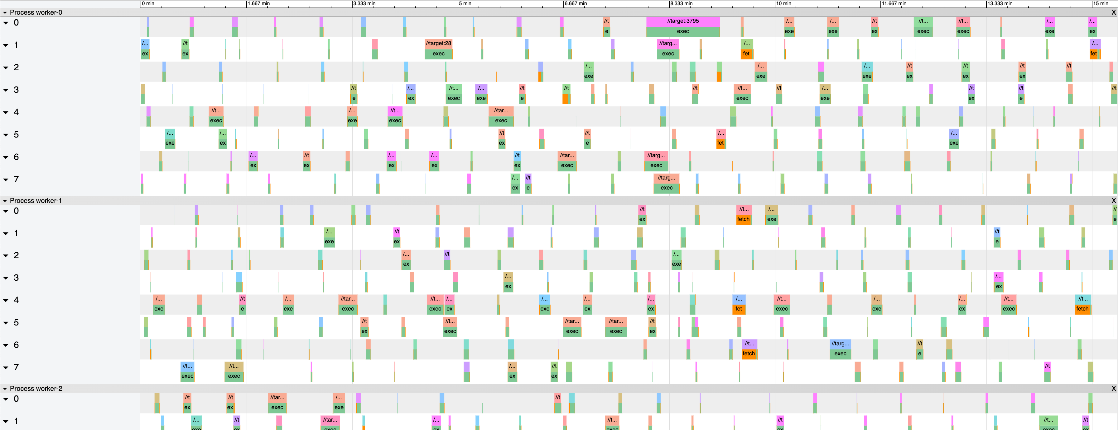
There was queuing but the cluster was… almost idle? Metrics said the workers’ overall utilization was 14% of which 12% was execution. Put another way:
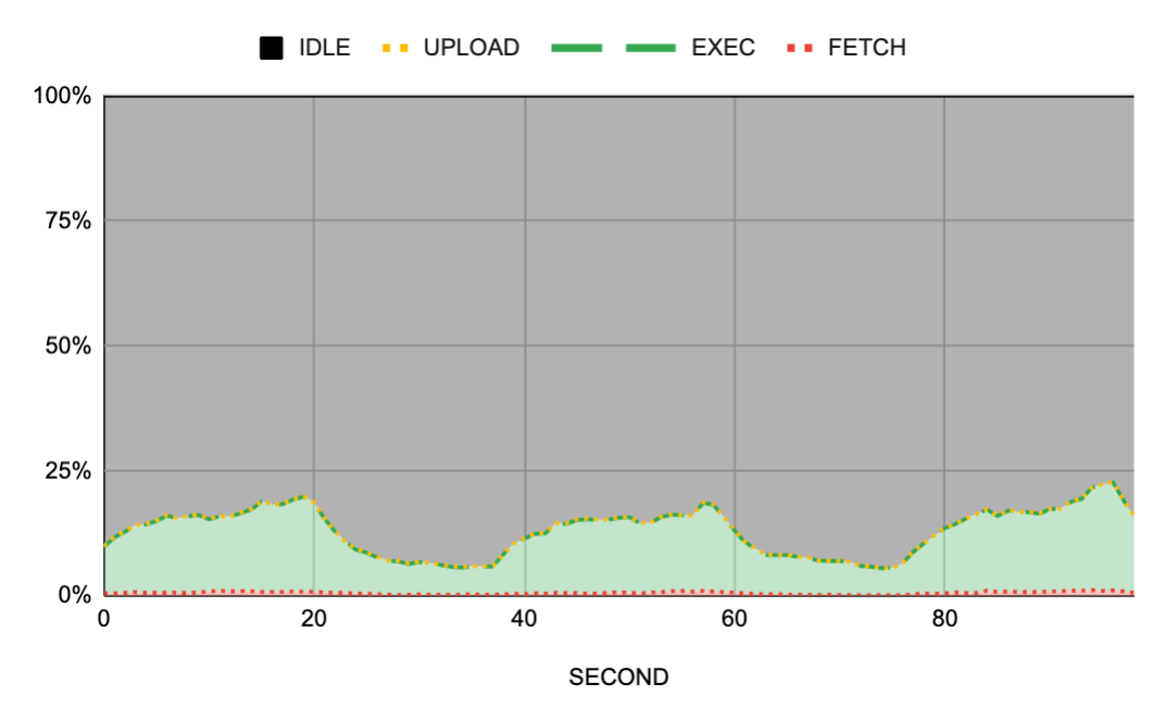
As you can see in both pictures, the cluster showed almost no activity. We had significant queuing but the cluster was mostly idle. It was great to see that the fetch and upload bands had almost disappeared, but now the workers were not being utilized.
Answering this piece of the puzzle was easier. If the workers weren’t receiving enough work to do, we had problems either in the job scheduler or in the frontends. Fortunately, we did have metrics on the CPU consumption of these actors of the system and they showed a clear problem: the scheduler had an allocation of 0.3 CPUs and it was maxed out.
Now… 0.3 CPUs?! Yes, that was ridiculously low: when provisioning a distributed system, if you have a singleton job, you’ll want to over-provision it just in case because, in the grand scheme of things, the cost will be negligible. But we had a low reservation, probably because of a copy/pasted configuration from months ago that we had no reason to revisit.
We had to revisit this CPU allocation now. We gave the scheduler more CPU and more RAM and waited for the next burst of activity.
Stunning performance
Here is what we saw after bumping up the scheduler CPU and RAM reservations during another busy time period:
Notice the green bars? Or rather… the lack of orange bars? That’s right. The workers were now 99% utilized with 97% of their time going into execution. And if we look into the other view of this same data:
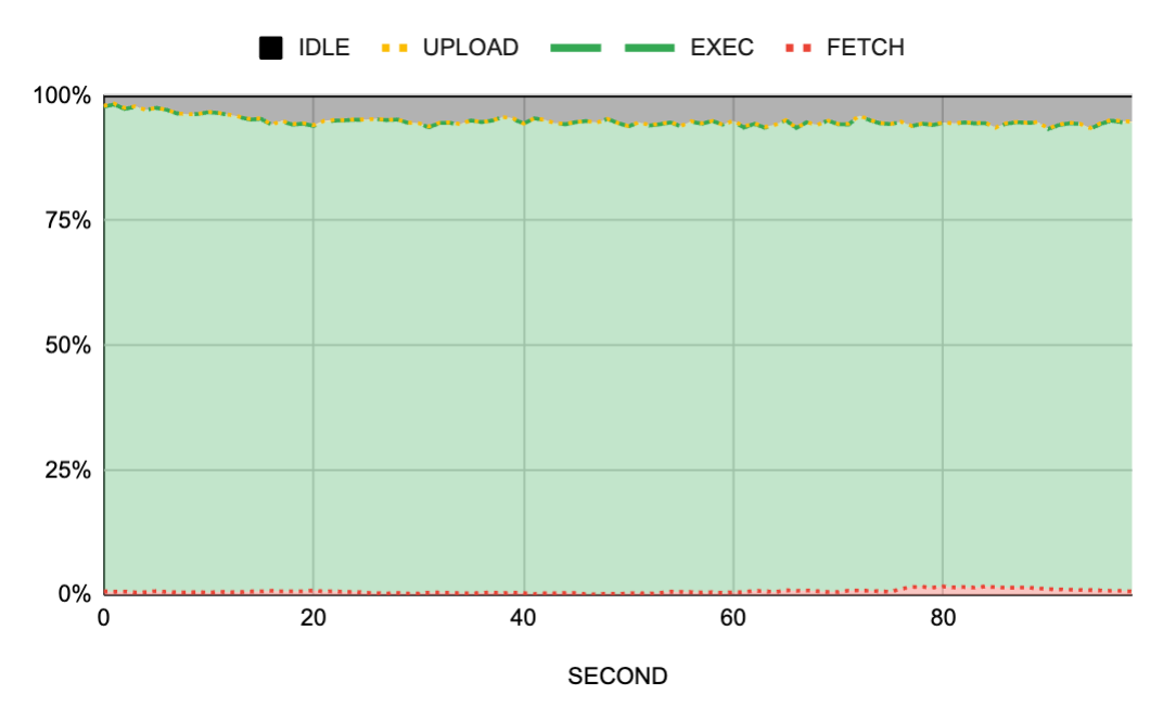
We can also see a sea of green with almost no network transfers and no idle time during busy periods. Problem(s) solved.
Our build farm can now support roughly 3x the load that it ran before. Disk-intensive tests are now as fast as when they run on a local development environment. And incremental builds are faster because of reduced end-to-end action execution times. But we aren’t done yet! While the system is now performing well, there are additional tuning operations we must do to improve the reliability of the system, to minimize hiccups during maintenance periods, and to reduce the overall monetary cost.
Takeaways
Here are my takeaways from this exercise:
- Visualizations are an incredibly powerful tool to understand a distributed system. You can have all the metrics and time series you want about individual performance indicators, but unless you can tie them together and give them meaning, you’ll likely not understand what’s going on. In our case, the trace visualizations enlightened us almost immediately once we could see them.
- Hypotheses are great to guide investigations, but measurements are crucial to come out with the correct root causes. In this case, I started with the assumption that we had problems in the cache nodes due to network starvation, and while we did end up finding network issues, they were in a completely different part of the system.
- Investing time into learning the metrics that your team’s telemetry collects is one of the best things you can do during onboarding. For me, this is the third time I join a team and postpone learning the schema and the queries needed to make sense of the data that the team collected, and I’ve regretted the delay every time. You can solve a ton of problems by just knowing where and how to look at existing data; stopping to learn these will pay dividends quickly.
- Developer productivity is an exciting area to work on. Don’t get fooled by folks or even companies that treat build engineers as second-class citizens. Developer productivity is a really broad area of engineering that covers everything from single-machine kernel-level tuning to distributed systems troubleshooting, while also interacting with (internal) customers and creating delightful user interfaces.
Sounds like the kind of thing you’d like to work on? Join our team! 🙂
